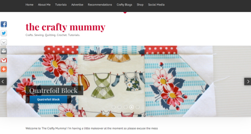
Did you notice? The Crafty Mummy has had a makeover! I decided it was time for a new look.
Warning: Geek Speak ahead!
For those who like to know these things, my new theme is called Prestige and it comes from ZigZagPress. It is quite different to the Pretty Young Thing theme that I have been using for ages, but it still is a child theme for the Genesis platform. I have found the Genesis platform and child themes so easy to work with that it would take a lot for me to change now. I have taught myself how to tweak my themes and I’m sure it would have been much harder without the Studiopress support forums.
The biggest difference is that this theme has a Homepage that is a totally different layout to the blog post pages. The theme has lots of flexibility with short codes to customise the home page so I plan to play with it a little more over time. For now I have the default homepage in place with a slider and recent posts.
Things I like:
- Home page slider – I’m using this instead of a header
- Full screen width
- 4 widget areas in the Footer
- It is built with HTML5 – which I don’t really understand but experts say is the newest thing and I notice Studiopress and ZigZagPress are upgrading all their themes to use it. I listened to a podcast last week about this and it was one of the things that prompted my makeover.
- It is optimised for various devices so it should look ok on phones and tablets as well without me doing anything.
Things I’m not so sure about yet:
- Colours – I expected to be able to switch out some of the colours (currently the blue buttons and some text) more but they are skins and I can’t find a way to change them… but I’m working on it!
- I’ve lost a widget area – “After Post Ad” – which I used before so I’ve had to use Genesis Simple Hooks instead.
- Something strange has happened to my Pages layouts – there don’t seem to be Pages in this theme – so I need to look at those more.
As with all changes, it takes a little getting used to. But considering I started playing with it Saturday night and was out most of the day on Sunday, I’m pretty happy with how it looks for only a couple of hours of setting up.
I still need to fix a couple of things (like some of the font colour in the footer) but if you come across anything that looks odd on your screen, by all means let me know. Sometimes blogs look different on different screens and I have a lot of content here to check on.
Where did I hear about HTML5?
I recently signed up for the Authority forum over at Copyblogger. This is a way that I am learning more about blogging. It is really aimed at those who are taking their blogs or websites to the next level so if that’s you, I’d highly recommend it. If only I had more hours in my days to listen to the podcasts!
Disclosure: There are some affiliate links in this post, linking back to products I have used and loved, which just means that if you decide to buy something, I get a little commission.




It looks very ‘clean’ and the white background makes everything else pop.
It looks great. You must be pleased.
Thanks Mary. There are a few things that I’m still tweaking but yes, I’m getting used to it