I know I’ve said it before but I’ll say it again:
I Love Pinterest!
When I come across something I like on Facebook, I will click through to check it out and my next step is always to pin it to Pinterest. If I read something I enjoy on a blog or website, I will pin it to Pinterest. If I see a tutorial for something I want to make one day, I will pin it to Pinterest.
Pinterest is my default bookmarking tool.
I don’t bookmark webpages in my browser very much at all. I pin them to Pinterest where not only can I find them again, but I can share them with my community.
And it seems the Crafty Mummy Community likes Pinterest too. I recently was so excited to see that over 10,000 people are following me over there! How great to know that I am sharing things of value to you all!
Pinterest has changed the way I create images on my blog. I always now create an image that I will want to pin. I don’t always make them tall rectangles – even though I know that is the best shape for Pinterest – but I do add words to images much more so that I can pin something that tells readers at a glance what they will find if they click through.
But for those who aren’t as addicted to Pinterest as I am, but perhaps are keen to start pinning their own blog posts, creating images for Pinterest can be daunting. Recently I came a cross a couple of images as I was thinking about this and realised they were great examples of how you could create a Pinterest image when you don’t really have an image to share for your post.
Let’s see what other people have done that has worked – or at least caught my eye!
Example 1: Using Words

This image uses only words but it works. The words could be the title of your story or they could be a quote from your post, like this one is. You can create an image like this with Canva – my current favourite online free tool for this kind of thing – or with software you probably already have like Word or PowerPoint.
Tips:
- Think about contrast – a dark background with light text or vice versa so that the words will stand out
- Think about size – bigger text is better – you want to be able to read it at a glance as we scroll through images
- Think about brevity – too many words and we won’t even read it
- Think about branding – you could use the same colours that you use for your blog theme or logo to reinforce your branding
- Add a name – either your name or your website, and maybe even a Twitter name if its is different
- Add a website URL, in case the image gets pinned incorrectly, or shared from there to other social media
- Don’t use too many different fonts – it makes the text harder to read
- Consider putting the keywords in bold text or capital letters
Example 2: Words and Shapes
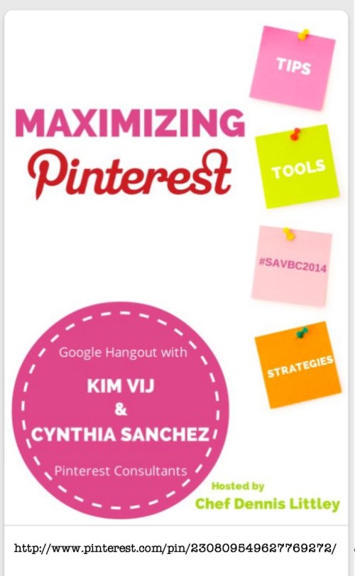
This example uses text and words again, but also has added some simple shapes. With Canva, Word or PowerPoint you can easily add shapes to give some interest to your text. Here the large circle encloses some extra information, and the squares down the side with cute push pins look like Post-it notes – much more interesting than bullet points. (In fact, I just watched a Webinar last week with Sonia Simone and Dave Paradi about creating slides for SlideShare that talked about shapes for bullet points in the Authority Forum. (Affiliate Link)
Tips:
- Use simple shapes
- Don’t be afraid to have a shape disappear off the edge of your image
- Don’t use more than two different shapes in one image
- Think about colours – you still want the text to stand out against the background
Example 3: Use a Stock Image
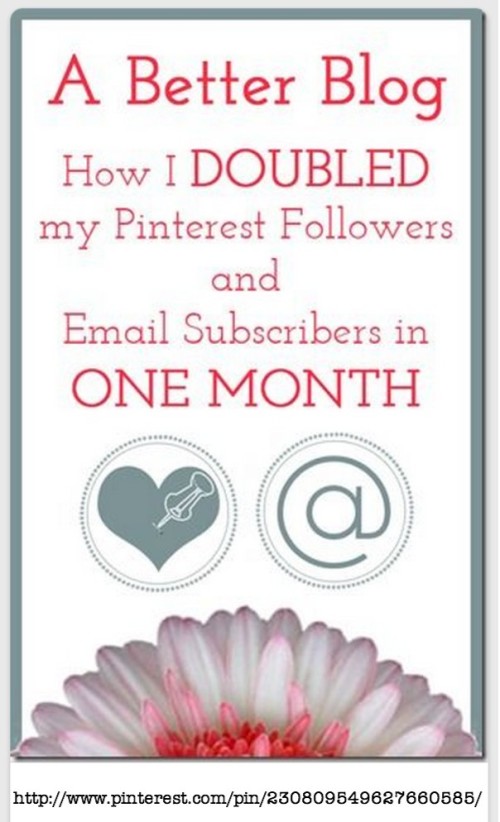
This image uses a stock photo – and not even the whole photo! It has been lined up to be partly off the edge of the image and just adds a little bit of interest. Stock photos of flowers, books, pencils, or even cute animals could be added to any text just for an eye-catching image. You might even consider using the same stock photo on all of your images add cohesiveness. It can be easy enough to create your own stock photos too. Just spend an afternoon taking photos of everyday items on a plain white piece of cardboard then you will have them ready when you want them. Otherwise there are plenty of free stock images available online.
Tips:
- Matching your image background to the colour of the background of your stock photo can give a seamless look.
- You might choose your text colour from the colours in the photo to tie them together visually.
- Canva has lots of stock photos to choose from, or you can load your own images.
- You don’t have to use the whole photo – you could slide it off the edge of your image.
- Use photos as elements in the text – for example a pencil as a line, or a fork as a letter “Y”, or a coin as a dot point marker
So there you have it – some ideas for creating a ‘pinnable’ image for your blog posts when you don’t really have a suitable photo to use. Find me on Pinterest here, or check out the new Message tip i wrote about last week here.



This is a fabulous post, Tonya. I love that you pin everything you read, wish I could get to the computer more to do that, too!
I suppose I do most of my reading on my laptop so it is easy to pin. Perhaps if I was on my phone I wouldn’t as much.
Do you read on your iPad? Is it easy to pin from the browser there?
Thanks for sharing that with us. I am not very computer-literate so any help I can get is great.
You’re welcome – Canva is very intuitive to use so give that a go.